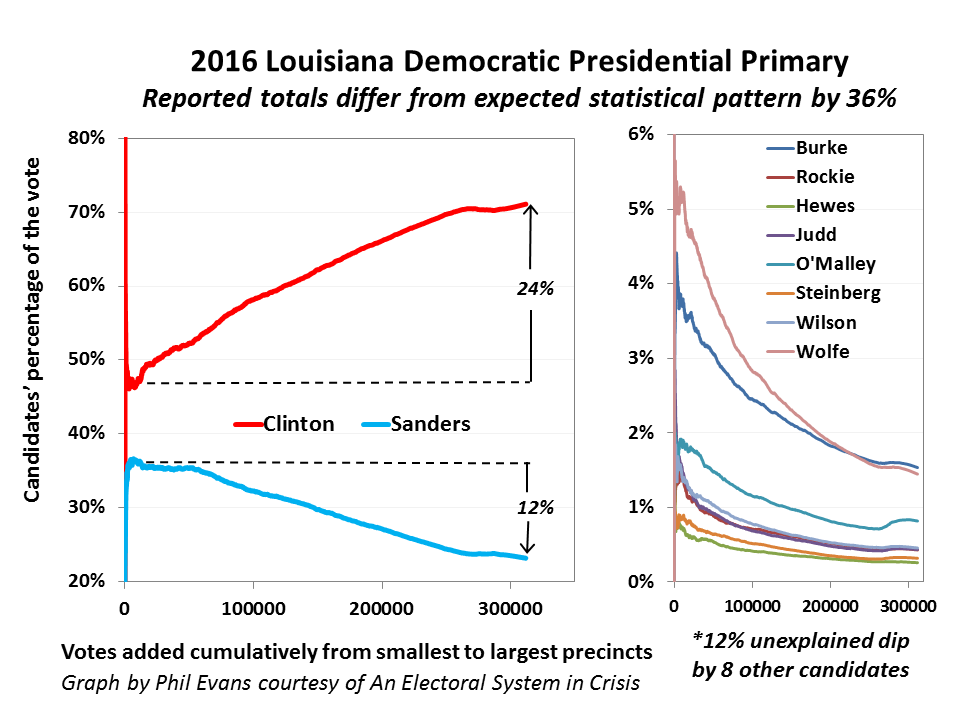
In our research we examined the election results of the 2016 presidential primaries, and found irregularities in the overwhelming majority of the twenty-one states that we analyzed. The data indicates, in particular, that the totals reported on the Democratic side in the race between Hillary Clinton and Bernie Sanders may not be correct. In state after state, independent examination by two separate analysts found suspect statistical patterns giving Clinton inflated percentages, that in all likelihood, are not fully based on actual votes, and showing Sanders with what appear to be artificially depressed totals.
Our current estimate of the overall difference between the reported totals and the expected statistical pattern is 12.82% of the primary votes. That estimate is based on 11 states where we had 2 analysts independently examine the results with identical findings. The estimate was reported in politico.com. It is a significant difference that could have changed the outcome of the 2016 Democratic presidential primary. This research is ongoing. We are continuing to evaluate different methods to measure the accuracy of the vote and detect potential manipulation, and will post updates here.
On this page are the graphs and analysis of individual states. The studies were done by our lead statistician Anselmo Sampietro and Phil Evans - the engineer who designed the method - each working separately with no knowledge of the other analyst’s conclusions. Their results are identical. The analysis of each state was done using official state election results. At the end of our paper, we include links to the election results so that others can replicate the work. Evans has provided estimates of how far off the reported results are from the expected statistical pattern.
The story of how Phil Evans developed this method is detailed in the section of our paper called What is that Pattern? Our expectations of the statistical patterns are determined by the Law of Large Numbers, and the methodology of the study is explained in that same section of the paper.
More graphs to come. Please check back or follow me on twitter @luluFriesdat.


